
Coach Wallace helps a student working with Net.Create
This wasn’t a failed classroom-management plan, though. It was democracy at work. Across five world history classes, Coach Wallace’s students used a network diagram to propose, and vote on, new classroom rules as part of a learning experience about democracy in Ancient Greece. Students began by creating “rules” they’d like to have in class as nodes or circles in the network, and then connecting their names to the ones they wanted to vote for. Initially, all of the student votes were represented in the network, but as the activity progressed, students were randomly assigned Athenian voting eligibility requirements: male, citizen, landowner. Coach Wallace filtered, or used a software feature to remove votes from students whose random characteristics didn’t meet Athenian requirements so that the class could see how important each individual vote was, and what happened to their new classroom rules when only the votes that counted in Ancient Greece were left. This meant that students first saw the rules they had all voted for. Then, half of the students (those who were not citizens) suddenly faded out, and their votes no longer counted, shifting the final result. This was a powerful moment that helped the students see the impact of different kinds of status on voting in both Ancient Greece and the modern world.
This lesson was part of a partnership between Digital Promise, Indiana University, and Talladega County Schools to explore how data visualization tools can build data literacy skills and content knowledge while also connecting to students’ interests.
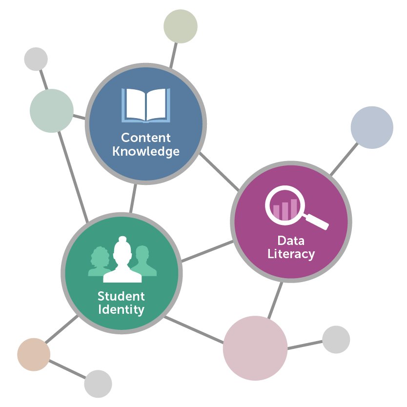
Data visualizations are ways of representing information that help make features of the data more salient. Carefully chosen data visualizations can heighten student engagement in learning by incorporating student interests, content knowledge, and data literacy in meaningful ways.
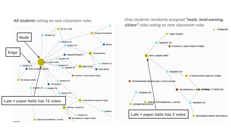
A comparison of a Net.Create network diagram of student votes. The diagram on the left shows all students voting on the new classroom rules while the diagram on the right shows only students who were randomly assigned “male, land-owning, citizen” roles voting on the rules.
Coach Wallace is excited to try more lessons using Net.Create and plans to ask students to build data visualizations that demonstrate connections about historical leaders and events and incorporate students’ interests and identities. “There’s no telling what you could learn from a student.”
What to consider when using data visualizations with students:
Interested in trying this in your classroom? Net.Create is currently still under development—sign up to be notified when it becomes available. In the meantime, data visualizations can be developed using free tools you may already have access to, such as Google Sheets, Microsoft Excel, Canva, Tableau, Tagxedo, Google Draw or Miro.
This material is based upon work supported by the National Science Foundation under Grant Numbers 2241705 & 2241706. Any opinions, findings, and conclusions or recommendations expressed in this material are those of the authors and do not necessarily reflect the views of the NSF.